display 是什么
display 是 CSS 中一个非常核心的属性,用于控制元素的显示类型(布局行为)。它决定了:
- 元素在页面中如何排列(是独占一行还是和其他元素并排);
- 元素是否生成盒子(box);
- 是否参与文档流;
- 子元素如何布局(比如是否开启 Flex 或 Grid 上下文)等。
简单说:display 决定了“这个元素怎么显示、怎么占位置”。
常见的 display 值及其含义
block(块级元素)
- 独占一行(前后自动换行);
- 可以设置
width、height、padding、margin; - 默认宽度为父容器的 100%;
- 在 HTML/uni-app 中,
<view>、<div>、<p>、<h1>等默认就是display: block。 block元素会自动换行,并且可以设置宽高、内外边距,非常适合做容器或独立区块。
<template>
<view class="page">
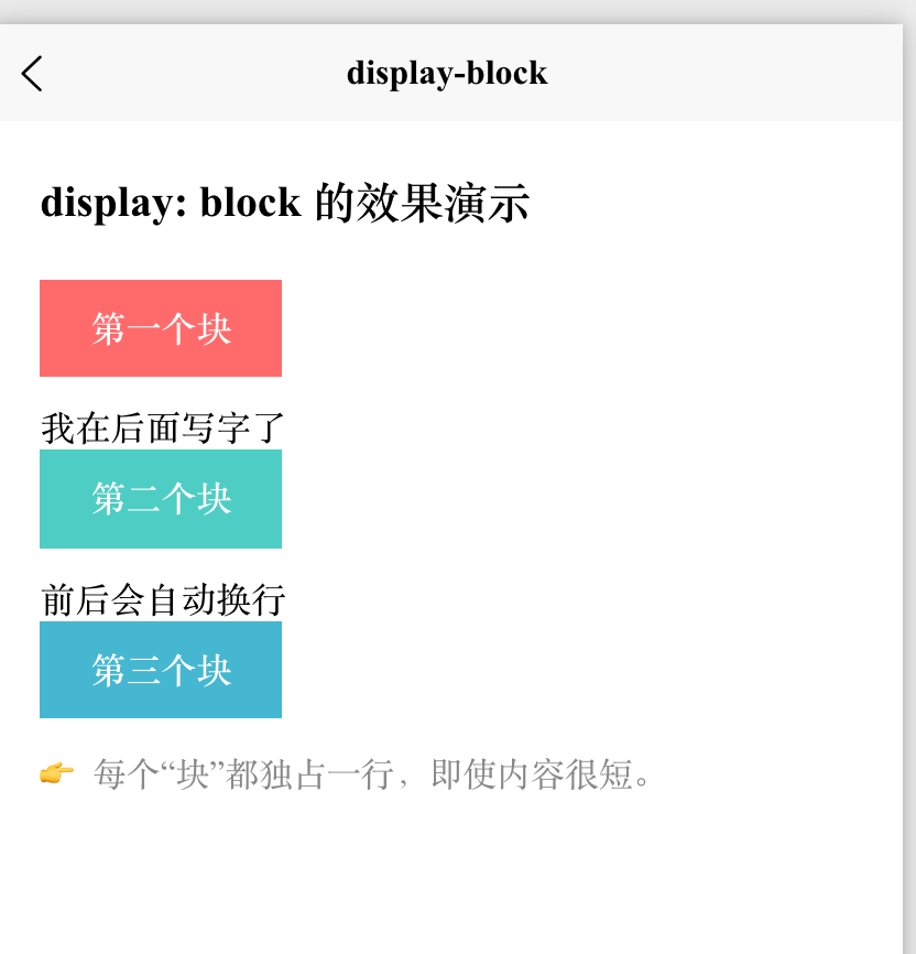
<text class="title">display: block 的效果演示</text>
<!-- 三个设置了 display: block 的 view -->
<view class="block-item red">第一个块</view> 我在后面写字了
<view class="block-item blue">第二个块</view>前后会自动换行
<view class="block-item green">第三个块</view>
<text class="tip">👉 每个“块”都独占一行,即使内容很短。</text>
</view>
</template>
<script setup>
// 无逻辑,纯展示
</script>
<style scoped>
.page {
padding: 40rpx;
}
.title {
font-size: 36rpx;
font-weight: bold;
margin-bottom: 40rpx;
display: block;
}
/* 关键:display: block */
.block-item {
display: block; /* 默认就是 block,但显式写出更清晰 */
width: 200rpx; /* 设置固定宽度 */
height: 80rpx; /* 设置固定高度 */
line-height: 80rpx; /* 垂直居中文本 */
text-align: center;
color: white;
font-weight: bold;
margin-bottom: 20rpx; /* 块之间加点间距 */
}
.red { background-color: #ff6b6b; }
.blue { background-color: #4ecdc4; }
.green { background-color: #45b7d1; }
.tip {
margin-top: 40rpx;
font-size: 28rpx;
color: #888;
}
</style>
inline(行内元素)
- 不会独占一行,多个元素会在同一行显示;
- 无法设置宽高(设置无效);
- 内容多长就占多宽(由内容撑开)。
- ⚠️ 重要提示:在 uni-app 中,
<view>默认是块级元素(block),即使你设置display: inline,在某些平台(如微信小程序)中可能仍表现异常。 - 最可靠的方式是用
<text>标签来演示inline行为,因为<text>在所有平台都天然支持行内布局。 - 水平方向的
padding/margin有效,但垂直方向可能不影响布局; - 例子:
<span>、<a>、<strong>、<em>。
| 特性 | display: inline |
|---|---|
| 是否换行 | ❌ 不换行,与其他 inline 元素同行 |
| 能否设宽高 | ❌ 不能(设置无效) |
| 能否设水平 margin/padding | ✅ 可以 |
| 能否设垂直 margin/padding | ⚠️ 可设置但不撑开布局(可能重叠) |
| 推荐标签 | <text>、<span>(在 H5 中) |
<template>
<view class="page">
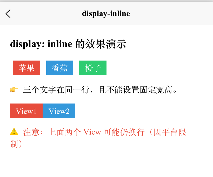
<text class="title">display: inline 的效果演示</text>
<!-- 使用 <text> 模拟 inline 元素(最准确) -->
<view class="demo-line">
<text class="inline-item red">苹果</text>
<text class="inline-item blue">香蕉</text>
<text class="inline-item green">橙子</text>
</view>
<text class="tip">👉 三个文字在同一行,且不能设置固定宽高。</text>
<!-- 对比:如果用 view + display: inline(可能无效) -->
<view class="demo-line" style="margin-top: 40rpx;">
<view class="inline-view red">View1</view>
<view class="inline-view blue">View2</view>
</view>
<text class="tip" style="color: #e74c3c;">⚠️ 注意:上面两个 View 可能仍换行(因平台限制)</text>
</view>
</template>
<script setup>
// 无逻辑,纯展示
</script>
<style scoped>
.page {
padding: 40rpx;
}
.title {
font-size: 36rpx;
font-weight: bold;
margin-bottom: 40rpx;
display: block;
}
.demo-line {
margin-bottom: 30rpx;
}
/* ✅ 正确方式:用 text 演示 inline */
.inline-item {
display: inline; /* 实际上 text 默认就是 inline */
padding: 10rpx 20rpx; /* 只有水平 padding 有效 */
margin: 0 10rpx; /* 水平 margin 有效 */
color: white;
font-size: 28rpx;
/* ❌ 下面这些对 inline 元素无效! */
/* width: 200rpx; */ /* 不生效 */
/* height: 100rpx; */ /* 不生效 */
}
.red { background-color: #e74c3c; }
.blue { background-color: #3498db; }
.green { background-color: #2ecc71; }
/* ⚠️ 不推荐:用 view + inline(在 uni-app 中可能失效) */
.inline-view {
display: inline;
width: 150rpx; /* 在 H5 可能有效,但在小程序通常无效 */
height: 80rpx; /* 同上 */
padding: 10rpx 20rpx;
color: white;
font-size: 28rpx;
}
</style>
inline-block(行内块元素)
- 多个元素在同一行显示(像
inline); - 可以设置宽高、内外边距(像
block); - 是实现“水平排列 + 精确控制尺寸”的经典方案。
- 常用于需要并排显示又需要控制尺寸的场景(如导航菜单项、图标按钮)。
| 需求 | inline |
block |
inline-block |
|---|---|---|---|
| 同一行显示 | ✅ | ❌ | ✅ |
| 设置宽高 | ❌ | ✅ | ✅ |
| 设置 margin/padding | ⚠️(垂直无效) | ✅ | ✅ |
| 适合做按钮/图标 | ❌ | ❌ | ✅ |
<template>
<view class="page">
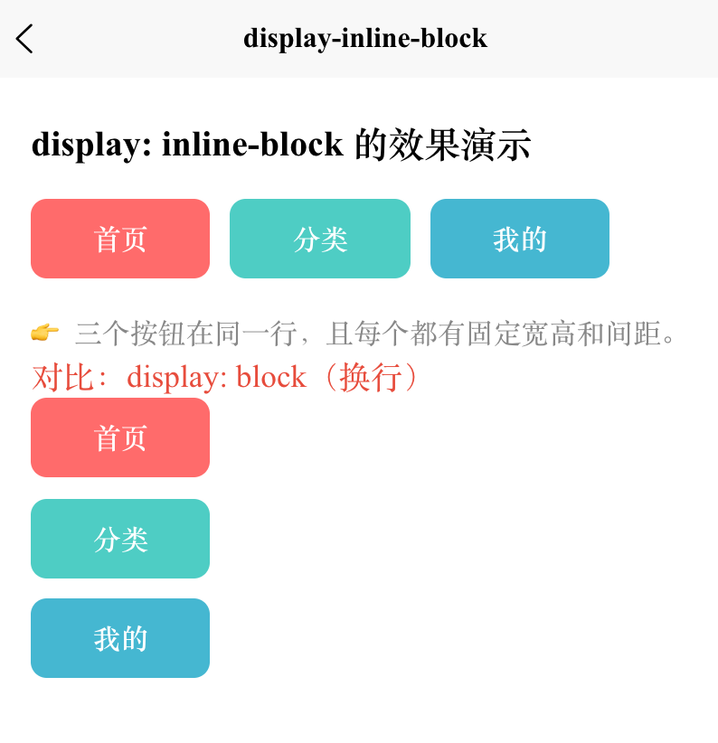
<text class="title">display: inline-block 的效果演示</text>
<!-- 三个 inline-block 元素 -->
<view class="demo-container">
<view class="item red">首页</view>
<view class="item blue">分类</view>
<view class="item green">我的</view>
</view>
<text class="tip">👉 三个按钮在同一行,且每个都有固定宽高和间距。</text>
<!-- 对比:如果用 display: block(会换行) -->
<text class="subtitle">对比:display: block(换行)</text>
<view class="demo-container">
<view class="item-block red">首页</view>
<view class="item-block blue">分类</view>
<view class="item-block green">我的</view>
</view>
</view>
</template>
<script setup>
// 无逻辑,纯展示
</script>
<style scoped>
.page {
padding: 40rpx;
}
.title {
font-size: 36rpx;
font-weight: bold;
margin-bottom: 30rpx;
display: block;
}
.subtitle {
font-size: 32rpx;
margin: 50rpx 0 20rpx;
color: #e74c3c;
}
/* ✅ 关键:inline-block 容器 */
.demo-container {
/* 容器本身是 block,但子元素 inline-block */
margin-bottom: 30rpx;
}
/* 🔑 核心样式:inline-block */
.item {
display: inline-block; /* 行内块:同行 + 可设宽高 */
width: 180rpx; /* ✅ 宽度生效 */
height: 80rpx; /* ✅ 高度生效 */
line-height: 80rpx; /* 垂直居中文本 */
text-align: center;
color: white;
font-size: 28rpx;
font-weight: bold;
border-radius: 16rpx;
margin-right: 20rpx; /* ✅ 水平间距有效 */
/* 注意:最后一个元素的 margin-right 不影响布局 */
}
/* 对比:block(会换行) */
.item-block {
display: block;
width: 180rpx;
height: 80rpx;
line-height: 80rpx;
text-align: center;
color: white;
font-size: 28rpx;
font-weight: bold;
border-radius: 16rpx;
margin-bottom: 20rpx; /* 垂直间距 */
}
.red { background-color: #ff6b6b; }
.blue { background-color: #4ecdc4; }
.green { background-color: #45b7d1; }
.tip {
margin-top: 20rpx;
font-size: 28rpx;
color: #888;
}
</style>
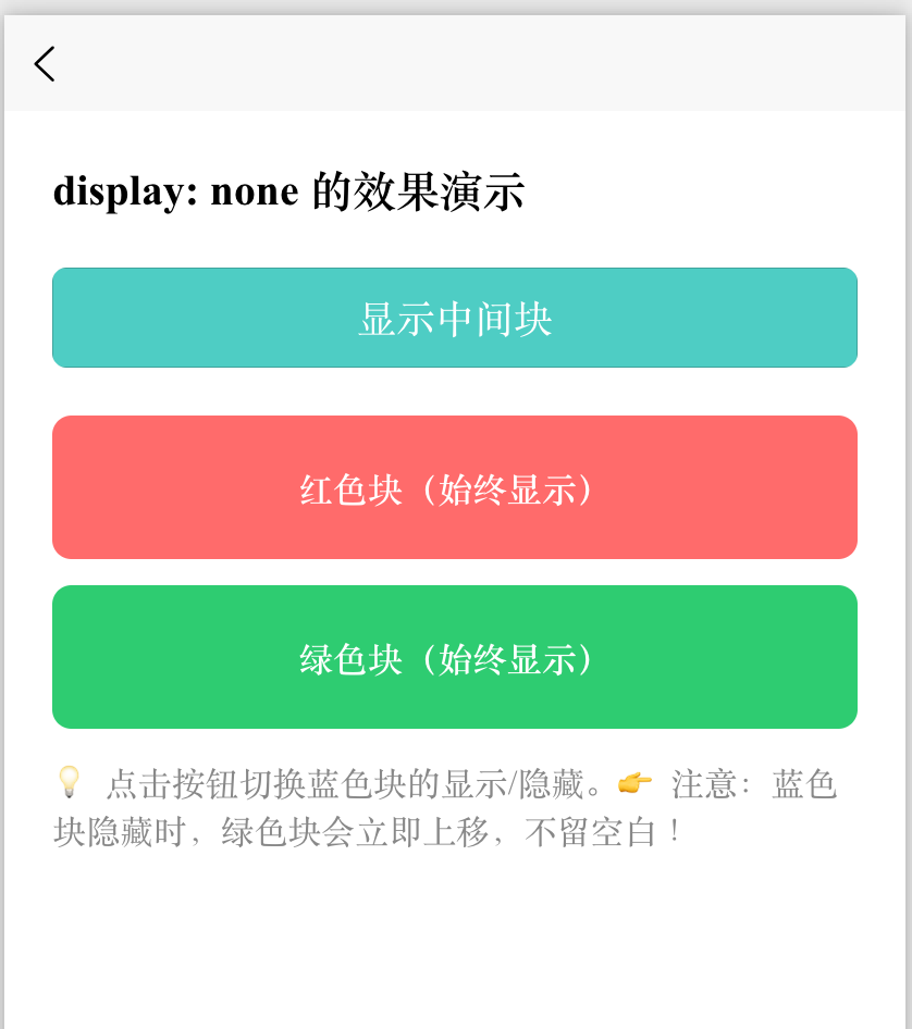
none(隐藏元素)
display: none会让元素 完全从页面中消失;- 不占据任何空间(后面的元素会“顶上来”);
- 与
visibility: hidden(隐藏但占位)有本质区别。
<template>
<view class="page">
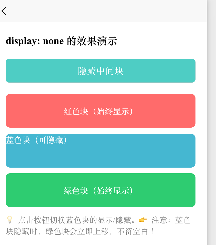
<text class="title">display: none 的效果演示</text>
<!-- 控制按钮 -->
<button class="toggle-btn" @click="toggleHidden">
{{ isHidden ? '显示中间块' : '隐藏中间块' }}
</button>
<!-- 三个色块:红、蓝(可隐藏)、绿 -->
<view class="box red">红色块(始终显示)</view>
<!-- 👇 这个蓝色块会根据 isHidden 切换 display: none -->
<view
class="box blue"
:style="{ display: isHidden ? 'none' : 'block' }"
>
蓝色块(可隐藏)
</view>
<view class="box green">绿色块(始终显示)</view>
<text class="tip">💡 点击按钮切换蓝色块的显示/隐藏。</text>
<text class="tip">👉 注意:蓝色块隐藏时,绿色块会立即上移,不留空白!</text>
</view>
</template>
<script setup>
import { ref } from 'vue';
// 响应式状态:控制是否隐藏
const isHidden = ref(false);
// 切换函数
const toggleHidden = () => {
isHidden.value = !isHidden.value;
};
</script>
<style scoped>
.page {
padding: 40rpx;
}
.title {
font-size: 36rpx;
font-weight: bold;
margin-bottom: 40rpx;
display: block;
}
.toggle-btn {
margin-bottom: 40rpx;
background-color: #4ecdc4;
color: white;
border-radius: 12rpx;
}
.box {
width: 100%;
height: 120rpx;
display: flex;
align-items: center;
justify-content: center;
color: white;
font-weight: bold;
margin-bottom: 20rpx;
border-radius: 16rpx;
}
.red { background-color: #ff6b6b; }
.blue { background-color: #45b7d1; }
.green { background-color: #2ecc71; }
.tip {
margin-top: 30rpx;
font-size: 28rpx;
color: #888;
}
</style>
如果换成 visibility: hidden:(非本例,但供你理解)
- 蓝色块看不见了;
- 但绿色块不会上移,蓝色块的位置仍然“空着”;
- 因为它只是“透明”,仍占据文档流中的空间。
想彻底移除元素并释放空间 → 用 display: none;
想暂时隐藏但保留位置 → 用 visibility: hidden。
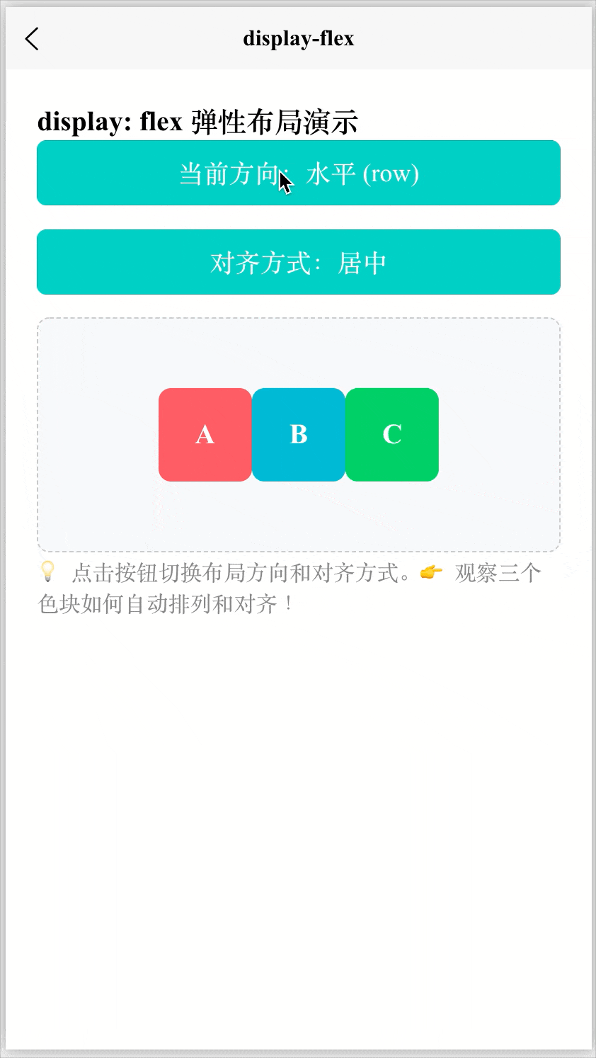
flex(弹性盒子)
将元素变为弹性容器(Flex Container),它的直接子元素就自动成为 “弹性项目”(Flex Items)。
“弹性” = 能伸能缩,自动适应空间,也就是子元素能根据容器空间自动调整大小和位置。
容器属性(作用于父元素)
属性 作用 display: flex启用弹性布局 flex-direction主轴方向( row/column)justify-content主轴对齐( center,space-between等)align-items交叉轴对齐( center,flex-start等)flex-wrap是否换行( nowrap/wrap)子项属性(作用于子元素)
属性 作用 flex: 1简写,表示“可伸缩,占满剩余空间” align-self单独控制某个子项的交叉轴对齐 具体可以查看笔记:HTML、CSS和JS的入门:Flex 布局(弹性盒子布局)
<template>
  <view class="page">
    <text class="title">display: flex 弹性布局演示</text>

    <!-- 控制按钮:切换布局方向 -->
    <button class="btn" @click="toggleDirection">
      当前方向:{{ isColumn ? '垂直 (column)' : '水平 (row)' }}
    </button>

    <!-- 控制按钮:切换对齐方式 -->
    <button class="btn" @click="cycleAlign">
      对齐方式:{{ currentAlign }}
    </button>

    <!-- Flex 容器 -->
    <view
      class="flex-container"
      :class="{ column: isColumn }"
      :style="{
        justifyContent: isColumn ? 'center' : alignMap[currentAlign].justify,
        alignItems: isColumn ? alignMap[currentAlign].align : 'center'
      }"
    >
      <view class="item red">A</view>
      <view class="item blue">B</view>
      <view class="item green">C</view>
    </view>

    <text class="tip">💡 点击按钮切换布局方向和对齐方式。</text>
    <text class="tip">👉 观察三个色块如何自动排列和对齐!</text>
  </view>
</template>

<script setup>
import { ref } from 'vue';

// 响应式状态
const isColumn = ref(false); // false = row(水平),true = column(垂直)

// 对齐方式选项
const alignOptions = ['居中', '左上', '右下', '两端对齐'];
const currentAlign = ref('居中');

// 对齐映射(根据方向动态调整 justify 和 align)
const alignMap = {
  '居中': { justify: 'center', align: 'center' },
  '左上': { justify: 'flex-start', align: 'flex-start' },
  '右下': { justify: 'flex-end', align: 'flex-end' },
  '两端对齐': { justify: 'space-between', align: 'center' }
};

// 切换主轴方向
const toggleDirection = () => {
  isColumn.value = !isColumn.value;
};

// 循环切换对齐方式
const cycleAlign = () => {
  const index = alignOptions.indexOf(currentAlign.value);
  currentAlign.value = alignOptions[(index + 1) % alignOptions.length];
};
</script>

<style scoped>
.page {
  padding: 40rpx;
}

.title {
  font-size: 36rpx;
  font-weight: bold;
  margin-bottom: 30rpx;
}

.btn {
  margin-bottom: 30rpx;
  background-color: #4ecdc4;
  color: white;
  border-radius: 12rpx;
}

/* 🔑 核心:Flex 容器 */
.flex-container {
  display: flex;               /* 启用弹性布局 */
  width: 100%;
  height: 300rpx;              /* 固定高度,便于观察垂直对齐 */
  background-color: #f8f9fa;
  border: 2rpx dashed #ccc;
  border-radius: 16rpx;
  padding: 20rpx;
  box-sizing: border-box;
}

/* 垂直布局时 */
.flex-container.column {
  flex-direction: column;      /* 主轴变为垂直 */
}

/* Flex 子项 */
.item {
  width: 120rpx;
  height: 120rpx;
  display: flex;
  align-items: center;
  justify-content: center;
  color: white;
  font-weight: bold;
  font-size: 36rpx;
  border-radius: 16rpx;
}

.red { background-color: #ff6b6b; }
.blue { background-color: #45b7d1; }
.green { background-color: #2ecc71; }

.tip {
  margin-top: 30rpx;
  font-size: 28rpx;
  color: #888;
}
</style>
grid(网格布局)
- 创建网格容器(Grid Container);
- 子元素按二维网格(行 + 列)排列;
- 适合复杂布局(如卡片墙、仪表盘)。
<template>
  <view class="page">
    <text class="title">display: grid 网格布局演示</text>

    <!-- 控制按钮:切换列数 -->
    <button class="btn" @click="cycleColumns">
      当前列数:{{ columns }} 列
    </button>

    <!-- Grid 容器 -->
    <view
      class="grid-container"
      :style="{
        gridTemplateColumns: `repeat(${columns}, 1fr)`
      }"
    >
      <!-- 动态生成 8 个网格项 -->
      <view
        v-for="index in 8"
        :key="index"
        class="grid-item"
        :class="getColorClass(index)"
      >
        {{ index }}
      </view>
    </view>

    <text class="tip">💡 点击按钮切换列数(2/3/4列)。</text>
    <text class="tip">👉 观察数字如何自动换行并填满网格!</text>
  </view>
</template>

<script setup>
import { ref } from 'vue';

// 响应式状态:当前列数
const columns = ref(2);

// 循环切换列数:2 → 3 → 4 → 2 ...
const cycleColumns = () => {
  columns.value = columns.value === 4 ? 2 : columns.value + 1;
};

// 根据索引返回不同颜色(让网格更美观)
const getColorClass = (index) => {
  const colors = ['red', 'blue', 'green', 'yellow', 'purple', 'orange', 'pink', 'cyan'];
  return colors[(index - 1) % colors.length];
};
</script>

<style scoped>
.page {
  padding: 40rpx;
}

.title {
  font-size: 36rpx;
  font-weight: bold;
  margin-bottom: 30rpx;
}

.btn {
  margin-bottom: 40rpx;
  background-color: #45b7d1;
  color: white;
  border-radius: 12rpx;
}

/* 🔑 核心:Grid 容器 */
.grid-container {
  display: grid;                /* 启用网格布局 */
  gap: 20rpx;                   /* 网格项之间的间距(行+列) */
  padding: 20rpx;
  background-color: #f8f9fa;
  border-radius: 16rpx;
  /* grid-template-columns 由 JS 动态设置 */
}

/* 网格项 */
.grid-item {
  height: 160rpx;
  display: flex;
  align-items: center;
  justify-content: center;
  color: white;
  font-weight: bold;
  font-size: 36rpx;
  border-radius: 16rpx;
}

/* 颜色类 */
.red { background-color: #ff6b6b; }
.blue { background-color: #4ecdc4; }
.green { background-color: #2ecc71; }
.yellow { background-color: #f9ca24; }
.purple { background-color: #a55eea; }
.orange { background-color: #f0932b; }
.pink { background-color: #eb4d4b; }
.cyan { background-color: #6c5ce7; }

.tip {
  margin-top: 30rpx;
  font-size: 28rpx;
  color: #888;
}
</style>
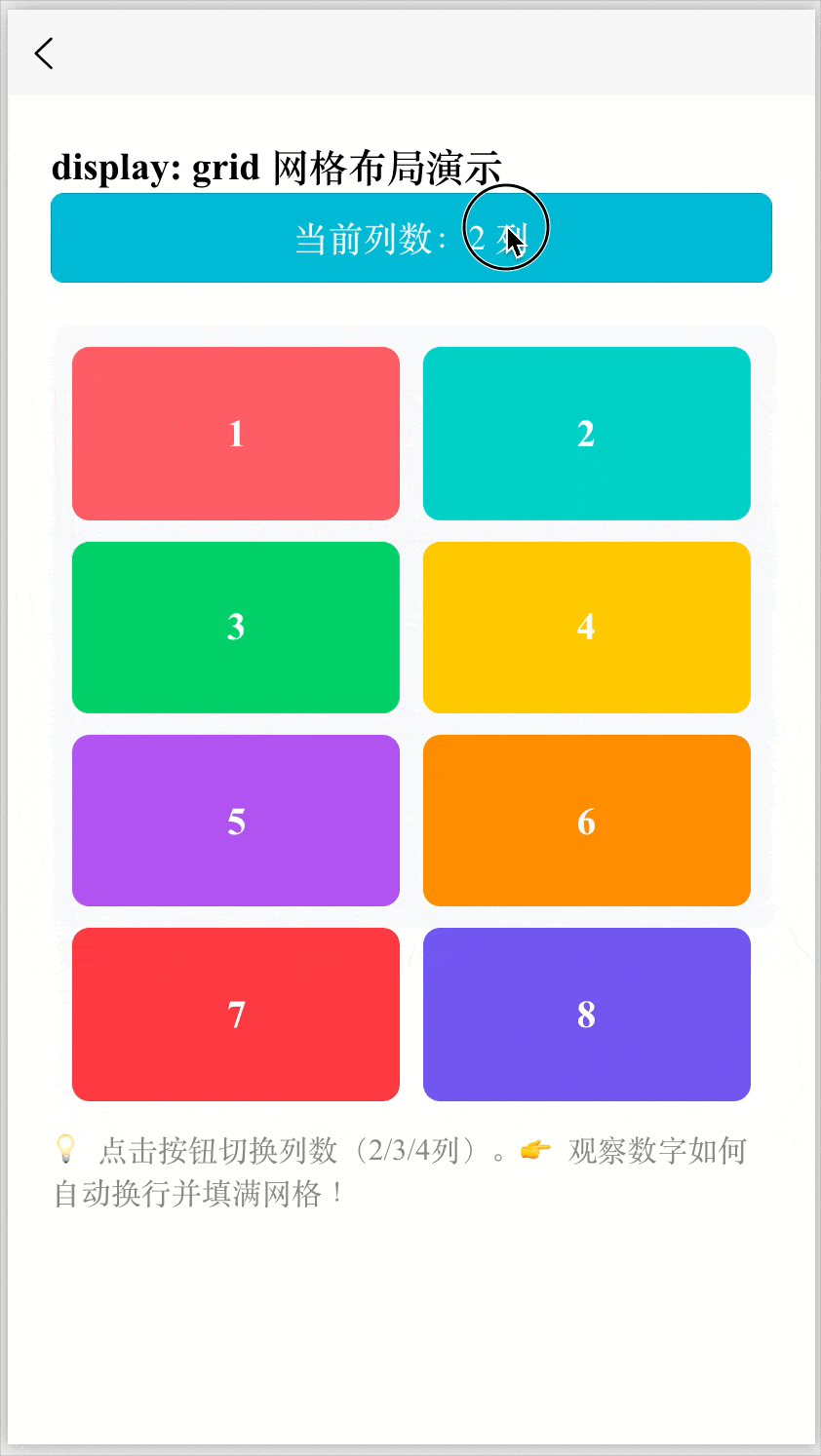
table / table-row / table-cell 等
- 模拟 HTML 表格的显示行为;
- 虽然现在少用,但在某些兼容性场景仍有价值。
display: table;
display: table-cell;
contents(不常用但强大)
- 元素自身不生成任何盒子,但其子元素仍正常渲染;
- 好比“透明外壳”,常用于无障碍或布局穿透。
display: contents;
flow-root(较新)
- 创建一个新的块格式化上下文(BFC),常用于清除浮动;
- 类似于
overflow: hidden的效果,但语义更清晰。
display: flow-root;
Grid 常见属性
容器属性
| 属性 | 作用 | 常见示例 |
|---|---|---|
display: grid |
开启 Grid 布局 | display: grid; |
grid-template-columns |
定义列宽 | grid-template-columns: 1fr 1fr; |
grid-template-rows |
定义行高 | grid-template-rows: 100px auto; |
gap |
行列间距(简写) | gap: 10px; |
row-gap |
行间距 | row-gap: 20px; |
column-gap |
列间距 | column-gap: 20px; |
justify-items |
子元素水平对齐 | justify-items: center; |
align-items |
子元素垂直对齐 | align-items: center; |
place-items |
align + justify 简写 | place-items: center; |
justify-content |
整个 Grid 水平对齐 | justify-content: space-between; |
align-content |
整个 Grid 垂直对齐 | align-content: center; |
place-content |
content 对齐简写 | place-content: center; |
grid-auto-columns |
隐式列尺寸 | grid-auto-columns: 100px; |
grid-auto-rows |
隐式行尺寸 | grid-auto-rows: minmax(100px, auto); |
grid-auto-flow |
自动排列方向 | grid-auto-flow: row; |
子项(item)常见位置控制属性
| 属性 | 作用 | 示例 |
|---|---|---|
grid-column-start |
列起始线 | grid-column-start: 1; |
grid-column-end |
列结束线 | grid-column-end: 3; |
grid-row-start |
行起始线 | grid-row-start: 1; |
grid-row-end |
行结束线 | grid-row-end: 2; |
grid-column |
列简写 | grid-column: 1 / 3; |
grid-row |
行简写 | grid-row: 1 / 2; |
grid-area |
指定区域 | grid-area: header; |
align-self |
垂直对齐自己 | align-self: end; |
place-self |
self 对齐简写 | place-self: center; |
子项(item)常见单个元素对齐属性
| 属性 | 作用 | 示例 |
|---|---|---|
justify-self |
水平对齐自己 | justify-self: center; |
align-self |
垂直对齐自己 | align-self: end; |
place-self |
self 对齐简写 | place-self: center; |
grid-template-columns
grid-template-columns 是 W3C 官方定义的 CSS Grid Module Level 1 规范中的核心属性,作用是:定义网格容器中的列数、每列的宽度。
/* 固定列宽 */
grid-template-columns: 100px 200px 100px;

/* 等分三列 */
grid-template-columns: 1fr 1fr 1fr;
/* 简写 */
grid-template-columns: repeat(3, 1fr);

/* 混合:固定 + 弹性 */
grid-template-columns: 100px 1fr 2fr;

/* 响应式:最小 150rpx,最大等分 */
grid-template-columns: repeat(auto-fill, minmax(150rpx, 1fr));
Grid vs Flex 核心对比
Flex = 排一排,Grid = 画格子
Grid 负责布局(layout),Flex 负责对齐(alignment)
| 对比项 | CSS Grid | Flexbox |
|---|---|---|
| 设计方向 | 二维布局(行 + 列) | 一维布局(单方向) |
| 控制范围 | 同时控制行和列 | 只控制一条轴 |
| 适合场景 | 页面整体布局 | 单行 / 单列排列 |
| 布局方式 | 网格思维 | 流式排列 |
| 对齐能力 | 非常强(区域定位) | 简单直接 |
| 响应式 | 强(auto-fit / minmax) | 中等 |
| 复杂布局 | 非常适合 | 会变复杂 |
| 学习难度 | 略高 | 较简单 |
/* Flex 的思维(线性排列)*/
.container {
  display: flex;
}
/* 效果像:
[ item ][ item ][ item ]*/


/* Grid 的思维(网格布局))*/
.container {
  display: grid;
}
/*
[ 1 ][ 2 ][ 3 ]
[ 4 ][ 5 ][ 6 ]
*/
Tips
fr 单位
fr 单位:表示按比例分配空间。
grid-template-columns: 1fr 2fr;
repeat() 函数
grid-template-columns: repeat(4, 1fr); = 写 4 次 1fr
repeat(auto-fit, ...):
意思是:能放多少列就放多少列。
浏览器会根据容器宽度自动计算:
屏幕宽 → 多放几列
屏幕窄 → 自动减少列数
minmax(最小值, 最大值)
给 Grid 的行或列设置「最小值 + 最大值」的弹性范围。
| 参数 | 含义 |
|---|---|
min |
最小尺寸(不能再小) |
max |
最大尺寸(最多扩展到这里) |
JavaScript的驼峰命名
<!-- ✅ 在 <style> 中 -->
<style>
.container {
  display: grid;
  grid-template-columns: repeat(3, 1fr); /* 连字符 */
}
</style>

<!-- ✅ 在 :style 动态绑定中 -->
<template>
  <view :style="{ gridTemplateColumns: 'repeat(3, 1fr)' }"></view>
</template>
这里用的是 gridTemplateColumns(驼峰式),原因如下:
| 场景 | 属性命名规则 | 示例 |
|---|---|---|
CSS 文件 / <style> 标签 |
使用连字符(kebab-case) | grid-template-columns |
JavaScript / Vue :style 对象 |
使用驼峰命名(camelCase) | gridTemplateColumns |
📌 这是 Vue 和所有前端框架(React、Svelte 等)的通用规则,因为:
grid-template-columns不是合法的 JavaScript 变量名(包含-);所以浏览器和框架约定:将 CSS 属性中的
-x转为大写X。
例如:
background-color→backgroundColorfont-size→fontSizegrid-template-columns→gridTemplateColumnsjustify-content→justifyContent

