基本作用
Stack 会把多个子组件 叠放在一起(Z 轴方向的布局),和 Row / Column 不同的是:
Row/Column是沿 X / Y 轴排列Stack是沿 Z 轴 叠放
以把 Stack 想象成 Photoshop 里的图层系统,后添加的元素会叠在前面的上面。
在 Flutter 的 Stack 中,默认的排列(叠放)顺序就是按照 children 列表里的代码顺序来决定的:
- 前面写的子组件(列表中靠前的)会先绘制,所以它会在下面。
- 后面写的子组件会后绘制,所以它会盖在上面。
Stack的定义
Stack({

    Key key,

    // 对齐方式,默认是左上角(topStart)
  	// 这里的对齐的位置是相对 Stack 这个容器内部来说的
    this.alignment = AlignmentDirectional.topStart,

    // 对齐方向
    this.textDirection,

    // 定义如何设置无定位子元素尺寸,默认为loose
    this.fit = StackFit.loose,

  // 对超出 Stack 显示空间的部分如何剪裁
  this.clipBehavior = Clip.hardEdge,

    // 子元素
    List<Widget> children = const <Widget>[],

})
基本语法
class StackPage extends StatelessWidget {
const StackPage({super.key});
@override
Widget build(BuildContext context) {
return Scaffold(
body: Stack(
// 居中对齐
alignment: Alignment.center,
// 子元素层叠放
children: [
// 三个色块
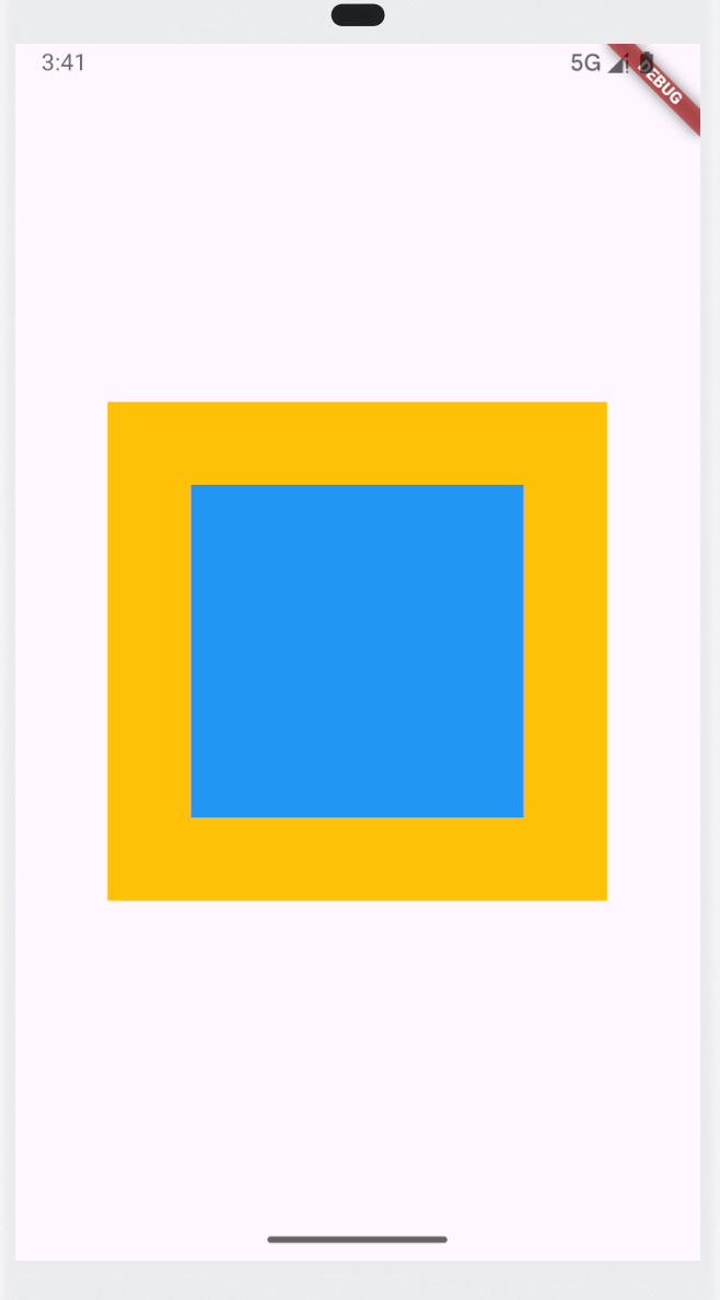
Container(width: 100, height: 100, color: Colors.green),
Container(width: 300, height: 300, color: Colors.amber),
Container(width: 200, height: 200, color: Colors.blue),
],
),
);
}
}
由于绿色色块更靠前,所有先绘制,又由于绿色色块小,会被红色色块盖住,所有不会显示。
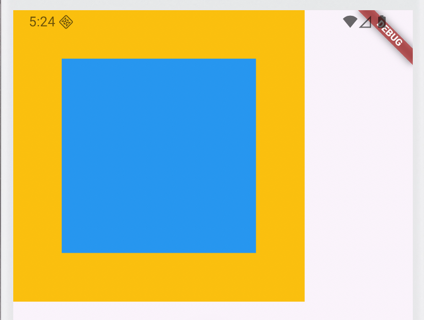
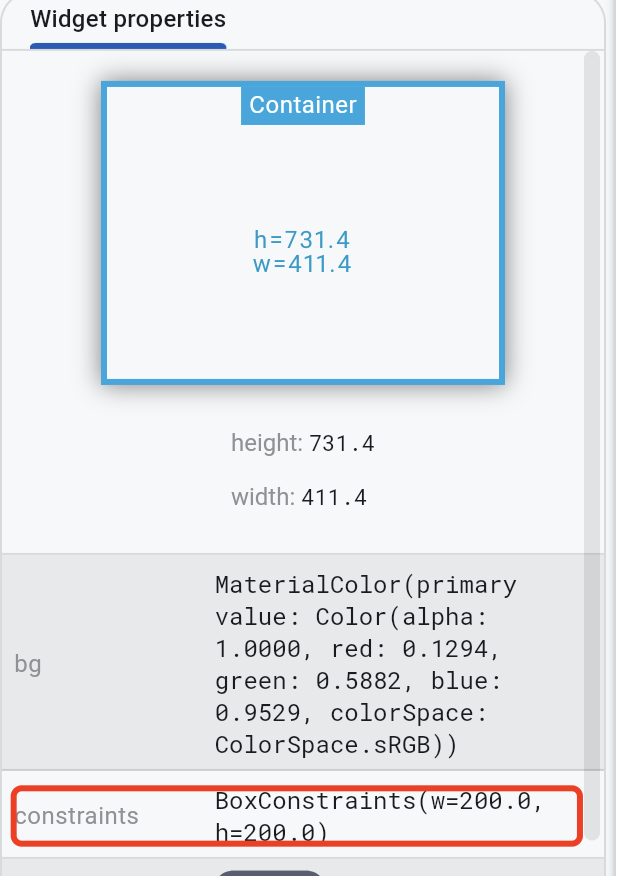
Stack的大小默认由最大子元素(300×300 的那个容器)决定。
这是因为Stack默认使用的是StackFit.loose,是一个松约束。那么Stack的大小就有最大的子组件决定。
const Stack({
  super.key,
  this.alignment = AlignmentDirectional.topStart,
  this.textDirection,
  this.fit = StackFit.loose,
  this.clipBehavior = Clip.hardEdge,
  super.children,
});
Stack的fit
fit 决定了 Stack 自身在父容器内如何确定大小,影响 非定位子元素 的布局。
| 值 | 含义 | 说明 |
|---|---|---|
StackFit.loose |
松约束 | Stack 尽可能包裹非定位子元素的最大尺寸(默认)。子元素不会被强制拉伸。 |
StackFit.expand |
紧约束 | Stack 尽可能填满父容器,非定位子元素会收到 父约束,容易被拉伸填满。 |
StackFit.passthrough |
透传约束 | Stack 大小 = 父约束大小,但不强制拉伸非定位子元素,约束传递给子元素时不修改。 |
如果我们把上面的那个案例中的fit改成StackFit.expand,那么最终是蓝色会占据整个屏幕
class StackPage extends StatelessWidget {
  const StackPage({super.key});

  @override
  Widget build(BuildContext context) {
    return Scaffold(
      body: Stack(
        // 全屏
        fit: StackFit.expand,
        // 居中对齐
        alignment: Alignment.center,
        // 子元素层叠放
        children: [
          // 三个色块
          Container(width: 100, height: 100, color: Colors.green),
          Container(width: 300, height: 300, color: Colors.amber),
          Container(width: 200, height: 200, color: Colors.blue),
        ],
      ),
    );
  }
}
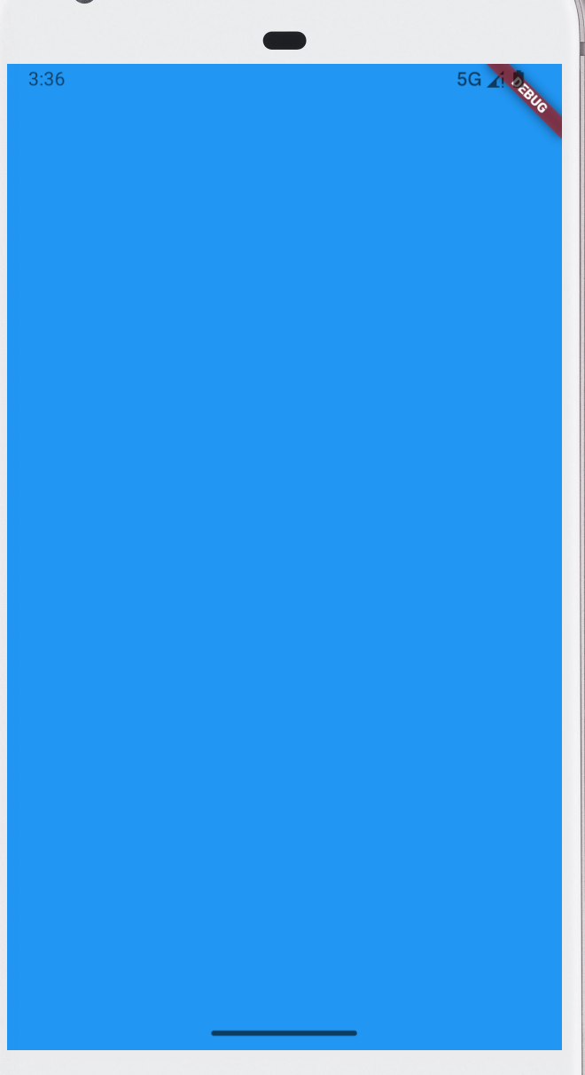
这是因为StackFit.expand设置了一个紧约束,把Stack的大小拉伸到整个屏幕的大小:
同时由于父组件的紧约束的作用,Container的大小也被拉伸到屏幕大小:
如果需要实现Container不被拉伸,中间还需要放一个组件,来隔绝:
class StackPage extends StatelessWidget {
  const StackPage({super.key});

  @override
  Widget build(BuildContext context) {
    return Scaffold(
      body: Stack(
        // 全屏
        fit: StackFit.expand,
        // 居中对齐
        alignment: Alignment.center,
        // 子元素层叠放
        children: [
          // 三个色块
          Align(
            alignment: Alignment.center,
            child: Container(width: 100, height: 100, color: Colors.green),
          ),
          Align(
            alignment: Alignment.center,
            child: Container(width: 300, height: 300, color: Colors.amber),
          ),
          Align(
            alignment: Alignment.center,
            child: Container(width: 200, height: 200, color: Colors.blue),
          ),
        ],
      ),
    );
  }
}
Align是一个松约束,可以让Container保持自身设计的大小。
Positioned绝对定位
class StackPage extends StatelessWidget {
  const StackPage({super.key});

  @override
  Widget build(BuildContext context) {
    return Scaffold(
      body: Stack(
        // 居中对齐
        alignment: Alignment.center,
        // 子元素溢出, none 不裁剪
        clipBehavior: Clip.none,
        // 子元素层叠放
        children: [
          // 三个色块
          Container(width: 100, height: 100, color: Colors.green),
          Container(width: 300, height: 300, color: Colors.amber),
          Container(width: 200, height: 200, color: Colors.blue),

          // 绝对定位
          const Positioned(left: 0, bottom: -50, child: FlutterLogo(size: 100)),
        ],
      ),
    );
  }
}
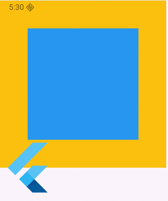
clipBehavior:决定超出 Stack 范围的内容是否裁剪:
Clip.none:不裁剪Clip.hardEdge / Clip.antiAlias:裁剪掉溢出的部分
Positioned 是用来给子组件绝对定位的,可以用 left/right/top/bottom 任意组合控制位置。
const Positioned({

    Key key,

    this.left, // 上下左右位置
    this.top,
    this.right,
    this.bottom,

    this.width, // 宽高
    this.height,

    @required Widget child,

})

