Flutter 的盒模型组成
一个 Widget(尤其是 Container)通常可以看作一个 矩形盒子,它由 四层 组成,从里到外:
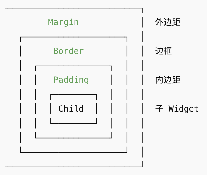
Child(子 Widget):实际显示的内容
Padding(内边距):Child的 Widget 与边框(Border)的间距
Border(边框):盒子外层的边框线,可以设置边框厚度
Margin(外边距):盒子与外部其他 Widget 的间距
常见属于盒模型的 Widget
| Widget 类型 | 盒模型元素支持情况 | 说明 |
|---|---|---|
Container |
child + padding + border + margin | 最典型的盒子模型 Widget,可以控制内边距、外边距、边框、背景色等 |
Padding |
padding | 专门用来增加内边距 |
Align / Center |
child + alignment | 可以对 child 进行对齐,但不直接提供 margin/padding |
DecoratedBox |
decoration(可含边框/背景色) | 提供边框和背景装饰,但没有内边距或外边距,需要配合 Padding/Container |
SizedBox |
width/height | 用于控制子 Widget 尺寸,相当于“约束盒子” |
Card |
margin + child + decoration | Material 风格卡片,有默认外边距、圆角、阴影 |
ConstrainedBox |
constraints | 用来给 child 设置最小/最大尺寸 |
不是典型盒子模型的 Widget
Text、Icon、Image 等 渲染内容 Widget
- 它们本身是内容,不带 padding/margin/border
- 需要用
Container或Padding包裹才能形成完整盒子
Row、Column、Stack 等 布局容器
- 它们是父容器,用来排列子 Widget,本身不一定有 margin/border/padding
- 可以通过包裹 Container 来形成盒子效果
代码示例
void main() {
runApp(const MyApp());
}
class MyApp extends StatelessWidget {
const MyApp({super.key});
@override
Widget build(BuildContext context) {
return MaterialApp(title: 'Flutter Demo', home: const BoxPage());
}
}
class BoxPage extends StatelessWidget {
const BoxPage({super.key});
@override
Widget build(BuildContext context) {
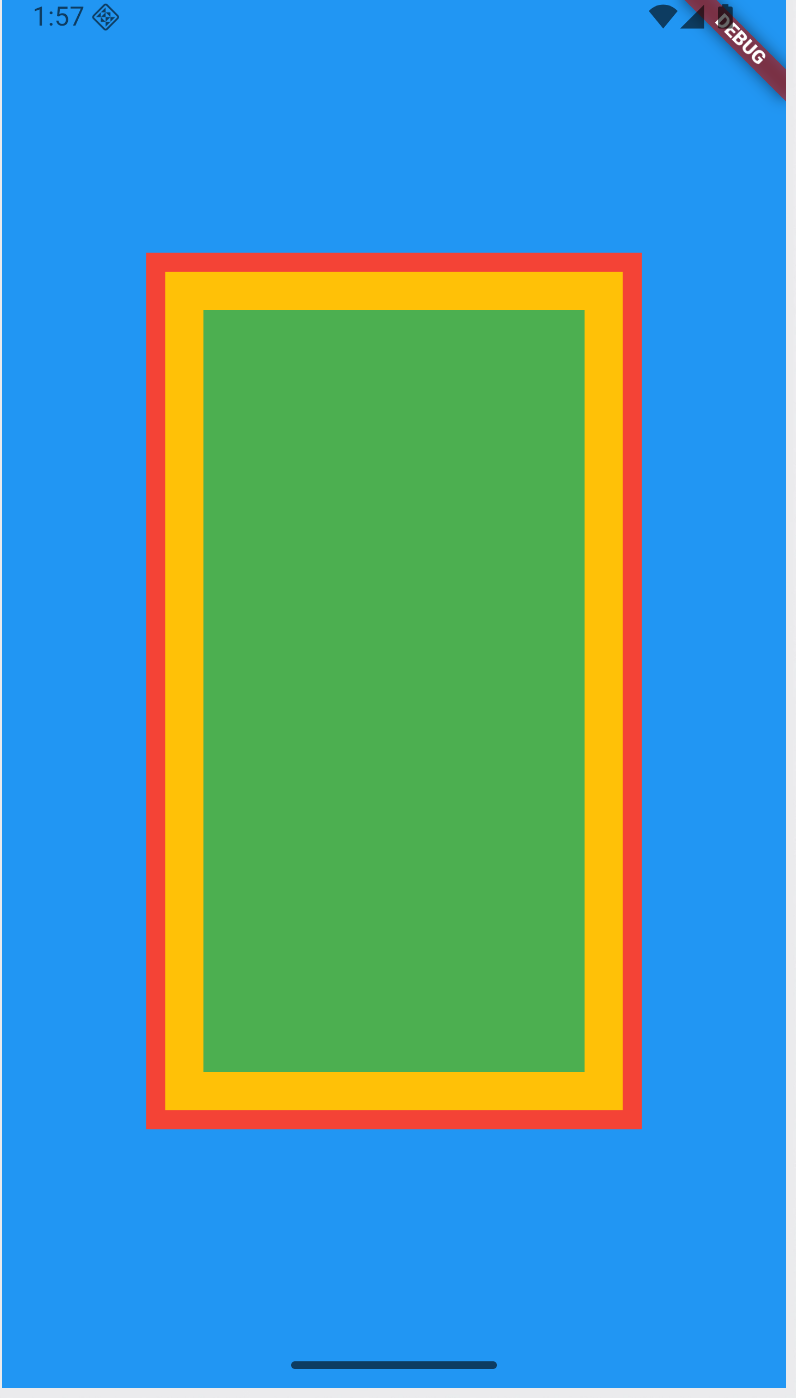
return Scaffold(
backgroundColor: Colors.blue,
body: Center(
child: Container(
// color: Colors.amber,
// Margin(外边距)
margin: const EdgeInsets.all(50),
// Padding(内边距)
padding: const EdgeInsets.all(20),
// 装饰样式
decoration: BoxDecoration(
// 背景色
color: Colors.amber,
// 边框
border: Border.all(color: Colors.red, width: 10),
),
// Content(内容)
child: Container(width: 200, height: 400, color: Colors.green),
),
),
);
}
}