入门案例
import 'package:flutter/material.dart';
void main() {
runApp(const MyApp());
}
class MyApp extends StatelessWidget {
const MyApp({super.key});
@override
Widget build(BuildContext context) {
return MaterialApp(
title: 'BottomAppBar Demo',
theme: ThemeData(useMaterial3: true, colorSchemeSeed: Colors.blue),
home: const HomePage(),
);
}
}
class HomePage extends StatelessWidget {
const HomePage({super.key});
@override
Widget build(BuildContext context) {
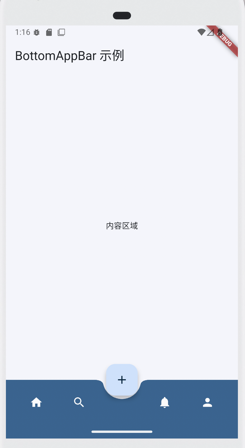
return Scaffold(
appBar: AppBar(title: const Text("BottomAppBar 示例")),
body: const Center(child: Text("内容区域")),
// floatingActionButton 用来指定一个 浮动操作按钮 (FAB)。
// FloatingActionButton: 是一个 Material Design 组件,通常用于表示一个主要操作。
floatingActionButton: FloatingActionButton(
onPressed: () {}, // onPressed:点击回调。
child: const Icon(Icons.add), // child:按钮内容(通常是 Icon 或 Text)。
),
// floatingActionButtonLocation 用来指定 FAB 的位置。
// FloatingActionButtonLocation: 是一个枚举,定义了 FAB 在屏幕上的位置。
// FloatingActionButtonLocation.centerDocked:底部中间,与 BottomAppBar 对齐(常见)。
// FloatingActionButtonLocation.centerFloat:底部中间,悬浮在内容上。
// FloatingActionButtonLocation.endDocked:右下角,与底部栏对齐。
// FloatingActionButtonLocation.endFloat:右下角,悬浮在内容上(最常见)。
// FloatingActionButtonLocation.startDocked / startFloat:左下角。
floatingActionButtonLocation: FloatingActionButtonLocation.centerDocked,
bottomNavigationBar: BottomAppBar(
shape: const CircularNotchedRectangle(), // 缺口形状
notchMargin: 6.0, // 缺口边距
color: Theme.of(context).colorScheme.primary,
elevation: 8,
child: Row(
mainAxisAlignment: MainAxisAlignment.spaceAround,
children: [
IconButton(
icon: const Icon(Icons.home),
color: Colors.white,
onPressed: () {},
),
IconButton(
icon: const Icon(Icons.search),
color: Colors.white,
onPressed: () {},
),
const SizedBox(width: 48), // 给 FAB 留空间
IconButton(
icon: const Icon(Icons.notifications),
color: Colors.white,
onPressed: () {},
),
IconButton(
icon: const Icon(Icons.person),
color: Colors.white,
onPressed: () {},
),
],
),
),
);
}
}
bottomNavigationBar
bottomNavigationBar 不是一个控件,而是 Scaffold 的一个属性。
它的类型是 PreferredSizeWidget?,你可以放任何合适的 Widget。
它的作用:用来放置页面底部的导航栏(通常是 BottomNavigationBar 或 BottomAppBar)。
BottomAppBar
BottomAppBar 是一个 具体的 Widget,它继承自 StatelessWidget。
你可以把它放到 Scaffold.bottomNavigationBar 里。
它的作用:提供一个可自定义的底部工具栏,支持和 FloatingActionButton 联动(显示缺口效果)。
BottomAppBar 的常用属性
| 属性 | 类型 | 作用 |
|---|---|---|
color |
Color? |
背景颜色(默认跟随主题) |
shape |
NotchedShape? |
定义与 FloatingActionButton 的缺口形状,常用 CircularNotchedRectangle() |
notchMargin |
double |
缺口与 FloatingActionButton 之间的间距 |
elevation |
double? |
阴影高度 |
clipBehavior |
Clip |
超出部分的裁剪方式 |
child |
Widget? |
主要内容区域,通常放 Row、IconButton 等 |
height |
double? |
高度(Flutter 3.7+ 引入) |
surfaceTintColor |
Color? |
材质表面色(Material 3 支持) |
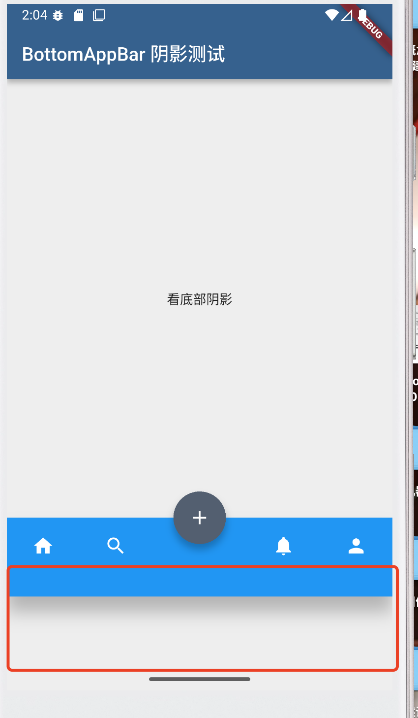
elevation:没什么作用
在 Flutter 的 Material Design 体系中,elevation 表示 Z 轴高度,数值越大,组件会离屏幕“更高”,阴影越明显。常见的有:
AppBar.elevation→ 顶部导航栏的阴影Card.elevation→ 卡片的阴影BottomAppBar.elevation→ 底部工具栏的阴影
当你设置 BottomAppBar.elevation 时,阴影会绘制在 BottomAppBar 的上边缘,即 内容区和底部栏的分界线位置。
- 默认值一般是
8(取决于主题) - 设置为
0→ 阴影消失,底栏和页面内容是平的 - 设置大于
8→ 阴影更深,看起来底栏更“浮”在内容上面
在 Material 3 里,大部分组件(包括 AppBar、BottomAppBar 等)的阴影表现被大幅弱化,甚至有时完全不画阴影,而是通过 颜色层级(surfaceTintColor、colorScheme.surfaceVariant) 来表现层次。所以 elevation: 0 和 elevation: 16 看起来差别不大,甚至完全看不到。
只有当Material 2 的时候,才会出现阴影,而且出现在**BottomAppBar 的底部**,所以底部需要流出空间。这些条件,都导致elevation没什么作用。
void main() {
  runApp(const MyApp());
}

class MyApp extends StatelessWidget {
  const MyApp({super.key});

  @override
  Widget build(BuildContext context) {
    return MaterialApp(
      title: 'BottomAppBar 阴影 Demo',
      theme: ThemeData(
        useMaterial3: false, // 先用 M2,阴影更直观
        colorSchemeSeed: Colors.blue,
      ),
      home: const HomePage(),
    );
  }
}

class HomePage extends StatelessWidget {
  const HomePage({super.key});

  @override
  Widget build(BuildContext context) {
    return Scaffold(
      backgroundColor: Colors.grey[200], // body 区域浅色
 			// ................省略部分代码............................

      // 关键:把 BottomAppBar 包一层 Container,留点“承接阴影”的空间
      bottomNavigationBar: Container(
        margin: const EdgeInsets.only(bottom: 100), // ⬅️ 给阴影留出来的空间
        child: BottomAppBar(
          color: Colors.blue,
          elevation: 16, // 提高阴影
   			// ................省略部分代码............................
          ),
        ),
      ),
    );
  }
}
BottomAppBar和PageView实现首页布局
代码
import 'package:flutter/material.dart';
void main() {
runApp(const MyApp());
}
class MyApp extends StatelessWidget {
const MyApp({super.key});
@override
Widget build(BuildContext context) {
return MaterialApp(
title: 'BottomAppBar + PageView Demo',
theme: ThemeData(useMaterial3: true, colorSchemeSeed: Colors.blue),
home: const HomePage(),
);
}
}
class HomePage extends StatefulWidget {
const HomePage({super.key});
@override
State<HomePage> createState() => _HomePageState();
}
class _HomePageState extends State<HomePage> {
// PageController 用来控制 PageView
final PageController _pageController = PageController();
// 当前选中的页面索引
int _currentIndex = 0;
// 底部按钮点击时,切换 PageView
void _onTabTapped(int index) {
// 修改 当前页面索引的值:_currentIndex
setState(() => _currentIndex = index);
// 直接跳转(无动画)
_pageController.jumpToPage(index);
// _pageController.animateToPage(index, duration: Duration(milliseconds: 300), curve: Curves.easeInOut); // 带动画
}
@override
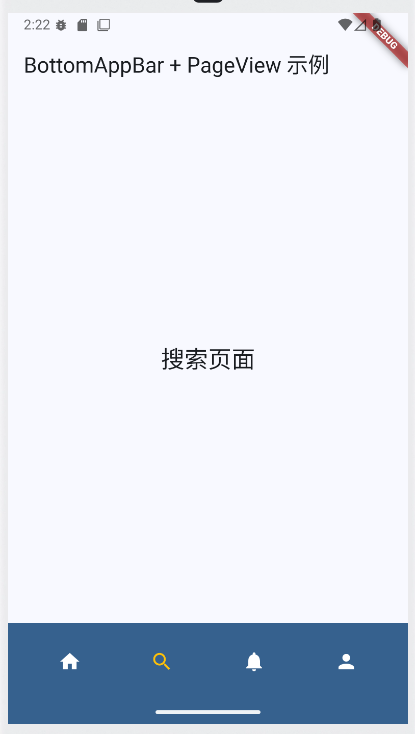
Widget build(BuildContext context) {
return Scaffold(
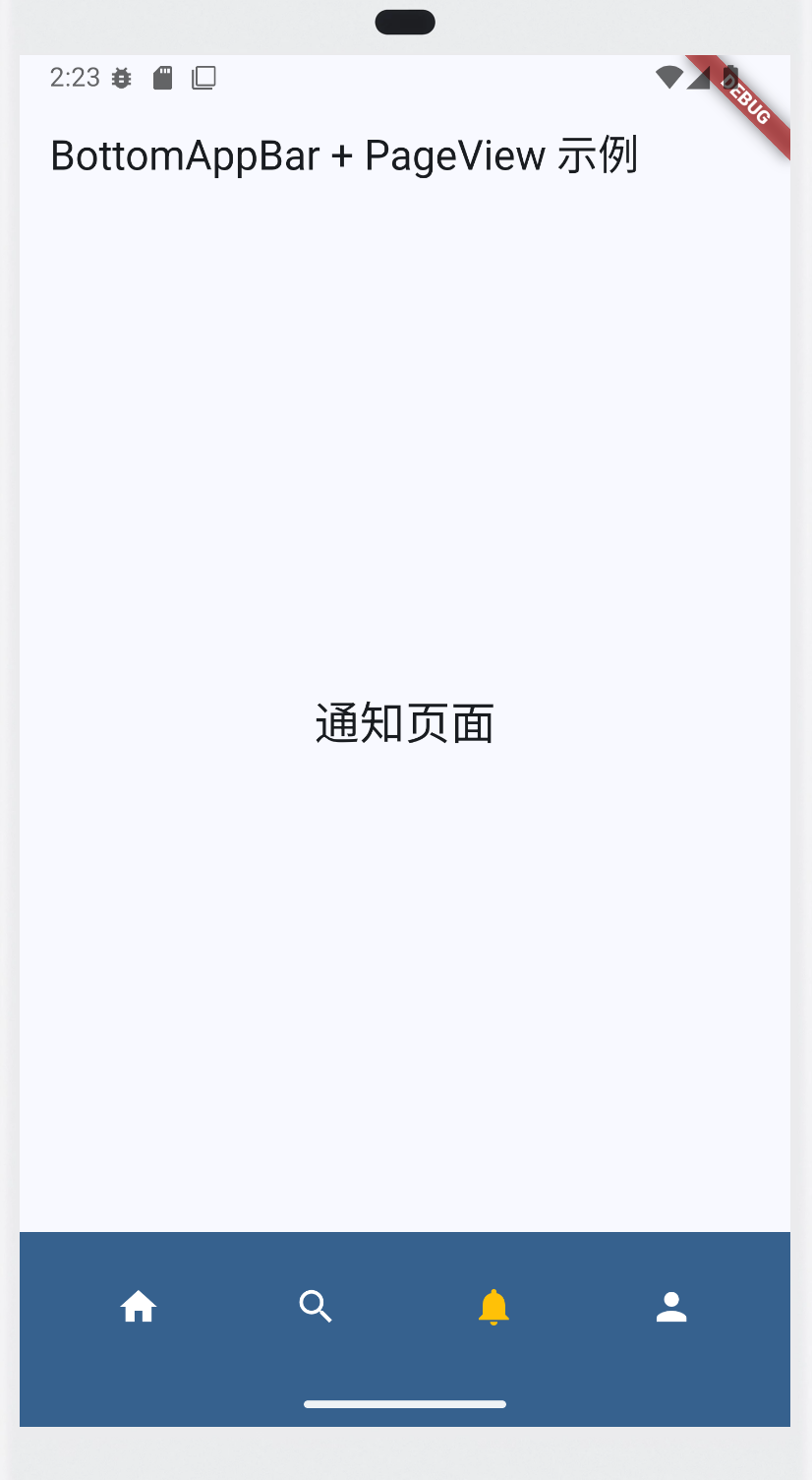
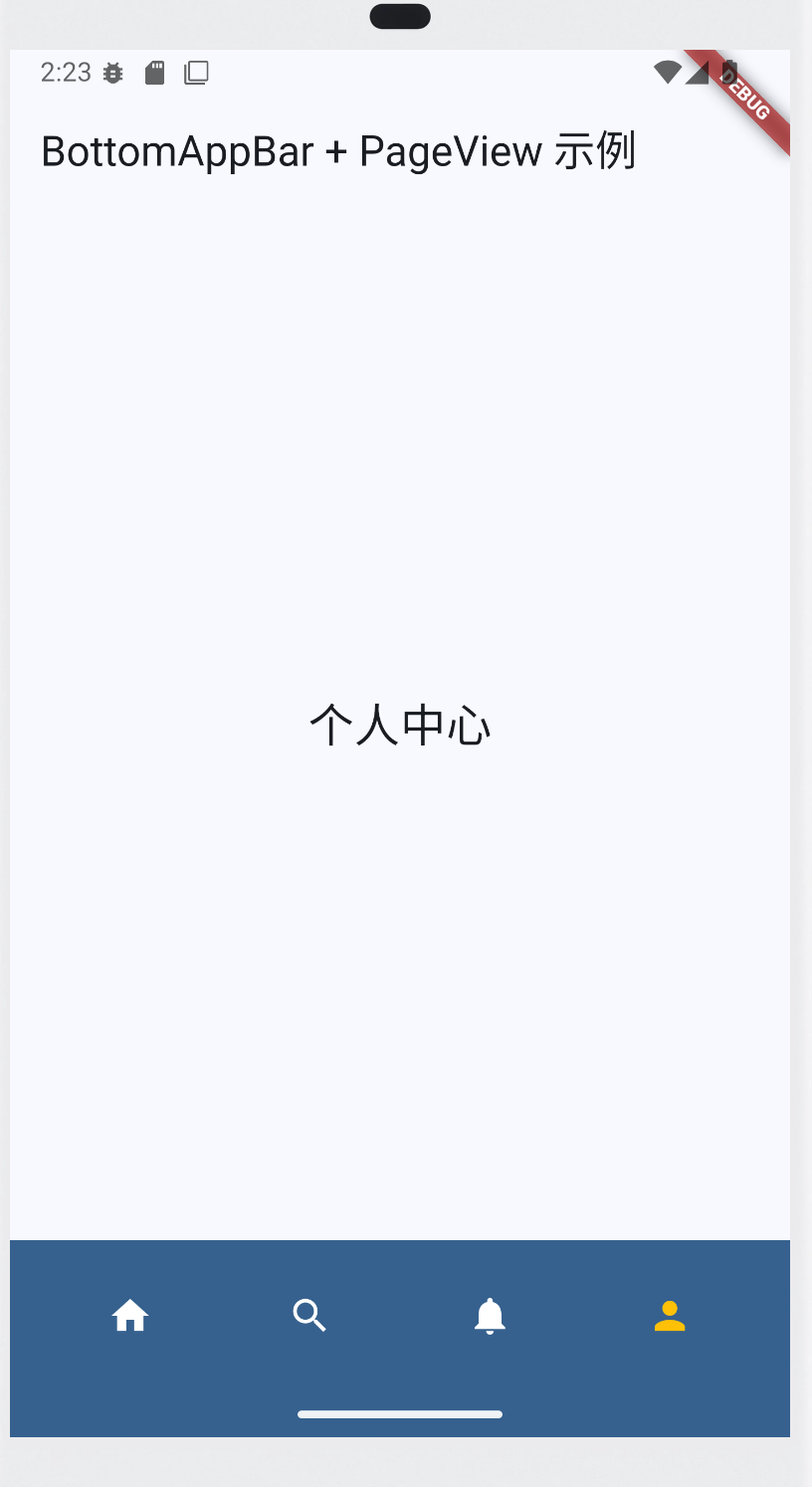
appBar: AppBar(title: const Text("BottomAppBar + PageView 示例")),
// 页面内容
body: PageView(
controller: _pageController,
onPageChanged: (index) {
setState(() => _currentIndex = index); // 同步底部按钮状态
},
// 要跳转的页面:默认从index=0开始
children: const [
Center(child: Text("首页内容", style: TextStyle(fontSize: 24))),
Center(child: Text("搜索页面", style: TextStyle(fontSize: 24))),
Center(child: Text("通知页面", style: TextStyle(fontSize: 24))),
Center(child: Text("个人中心", style: TextStyle(fontSize: 24))),
],
),
bottomNavigationBar: BottomAppBar(
color: Theme.of(context).colorScheme.primary,
child: Row(
mainAxisAlignment: MainAxisAlignment.spaceAround,
children: [
IconButton(
icon: const Icon(Icons.home),
color: _currentIndex == 0 ? Colors.amber : Colors.white,
onPressed: () => _onTabTapped(0),
),
IconButton(
icon: const Icon(Icons.search),
color: _currentIndex == 1 ? Colors.amber : Colors.white,
onPressed: () => _onTabTapped(1),
),
IconButton(
icon: const Icon(Icons.notifications),
color: _currentIndex == 2 ? Colors.amber : Colors.white,
onPressed: () => _onTabTapped(2),
),
IconButton(
icon: const Icon(Icons.person),
color: _currentIndex == 3 ? Colors.amber : Colors.white,
onPressed: () => _onTabTapped(3),
),
],
),
),
);
}
}
解释
PageView常用属性
children:要显示的页面列表(List<Widget>)。controller:控制器,配合PageController来跳转页面、获取当前页。onPageChanged:页面切换时的回调,返回新页面的 index。scrollDirection:滚动方向,默认Axis.horizontal(水平滚动),可改为Axis.vertical。physics:滚动物理效果,比如NeverScrollableScrollPhysics()可以禁用手势滑动。pageSnapping:是否强制对齐到整页,默认true。
PageController 的常用方法
jumpToPage(int index):无动画直接跳转到某页。animateToPage(int index, duration, curve):带动画地跳转到某页。page:当前的页面索引(double 类型,可取小数,表示滑动到一半)。initialPage:初始页面索引(在构造PageController时设置)。

