是什么
flutter_easyloading 是一个 轻量级的 loading HUD,用于在 Flutter App 中快速显示 加载框、成功提示、错误提示、信息提示 等。它的特点:
- 支持全局调用(不用手动传 context)
- API 简单,一行代码即可展示 loading
- 支持自定义样式(颜色、大小、mask、动画)
- 适合在网络请求、表单提交等场景下使用
入门案例
import 'package:flutter/material.dart';
import 'package:flutter_easyloading/flutter_easyloading.dart';
void main() {
runApp(const MyApp());
configLoading(); // 初始化全局样式
}
void configLoading() {
EasyLoading.instance
..indicatorType = EasyLoadingIndicatorType.fadingCircle
..loadingStyle = EasyLoadingStyle.dark
..indicatorSize = 40.0
..radius = 10.0
..maskColor = Colors.black.withOpacity(0.3)
..userInteractions = true
..dismissOnTap = false;
}
class MyApp extends StatelessWidget {
const MyApp({super.key});
@override
Widget build(BuildContext context) {
return MaterialApp(
title: 'EasyLoading Demo',
theme: ThemeData(primarySwatch: Colors.blue),
builder: EasyLoading.init(), // 关键:全局初始化
home: const HomePage(),
);
}
}
class HomePage extends StatelessWidget {
const HomePage({super.key});
Future<void> _simulateNetworkRequest() async {
EasyLoading.show(status: '加载中...');
// 模拟网络请求延时
await Future.delayed(const Duration(seconds: 2));
EasyLoading.showSuccess('加载成功!');
}
@override
Widget build(BuildContext context) {
return Scaffold(
appBar: AppBar(title: const Text('flutter_easyloading 入门案例')),
body: Center(
child: Column(
mainAxisAlignment: MainAxisAlignment.center,
children: [
ElevatedButton(
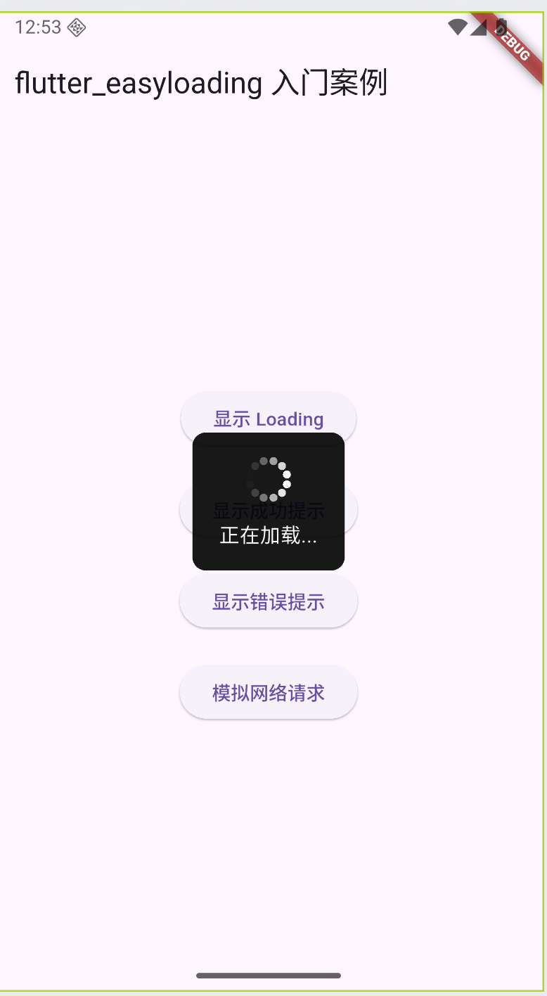
onPressed: () => EasyLoading.show(status: '正在加载...'),
child: const Text('显示 Loading'),
),
const SizedBox(height: 20),
ElevatedButton(
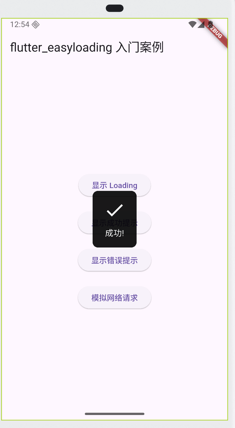
onPressed: () => EasyLoading.showSuccess('成功!'),
child: const Text('显示成功提示'),
),
const SizedBox(height: 20),
ElevatedButton(
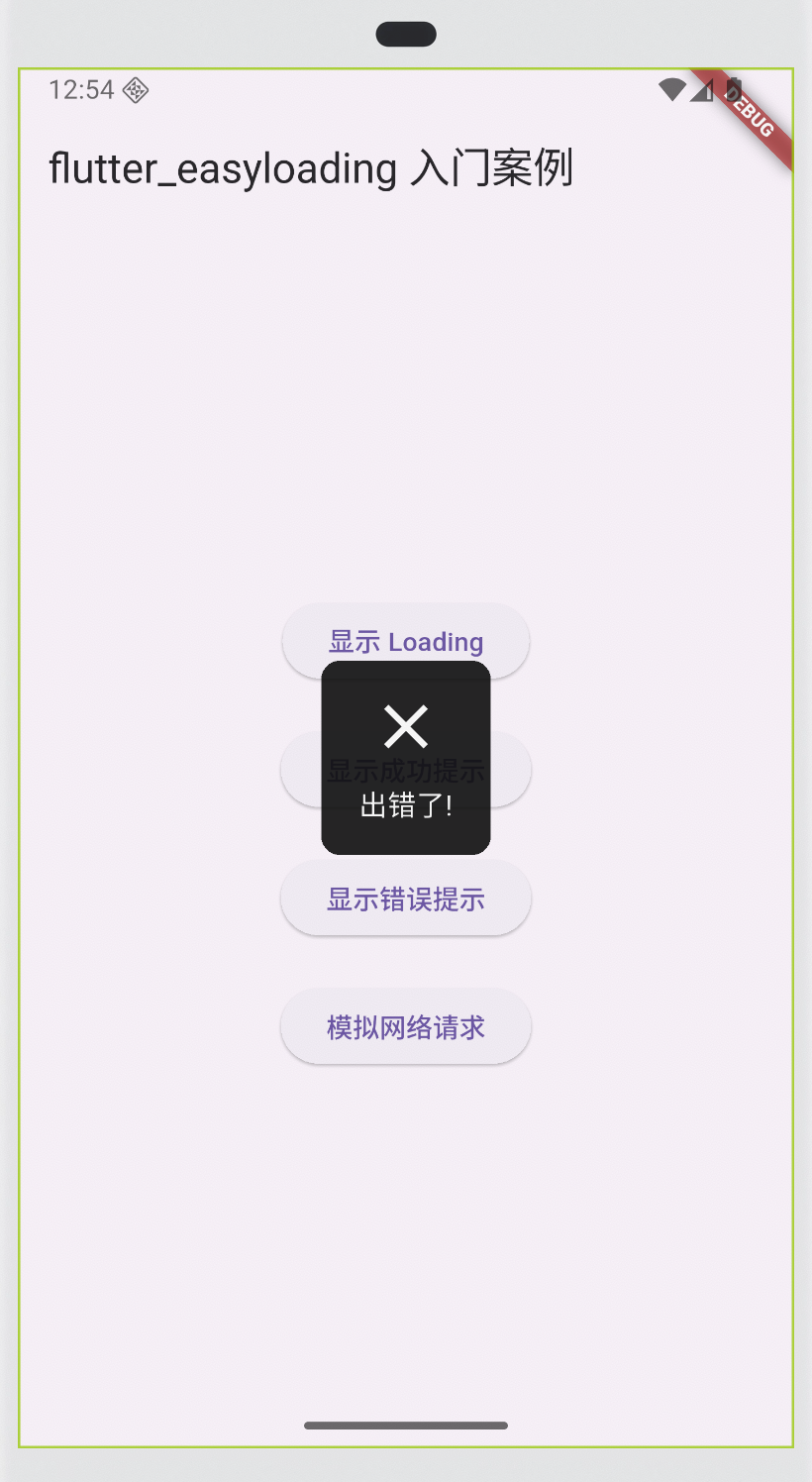
onPressed: () => EasyLoading.showError('出错了!'),
child: const Text('显示错误提示'),
),
const SizedBox(height: 20),
ElevatedButton(
onPressed: _simulateNetworkRequest,
child: const Text('模拟网络请求'),
),
],
),
),
);
}
}
如何使用
安装
flutter pub add flutter_easyloading
配置EasyLoading.instance
获取单例
EasyLoading内部是一个单例,通过EasyLoading.instance就可以获取单例,从而改变其配置
static EasyLoading get instance => _instance;
static final EasyLoading _instance = EasyLoading._internal();
  EasyLoading._internal() {
    /// set deafult value
    loadingStyle = EasyLoadingStyle.dark;
    indicatorType = EasyLoadingIndicatorType.fadingCircle;
    maskType = EasyLoadingMaskType.none;
    toastPosition = EasyLoadingToastPosition.center;
    animationStyle = EasyLoadingAnimationStyle.opacity;
    textAlign = TextAlign.center;
    indicatorSize = 40.0;
    radius = 5.0;
    fontSize = 15.0;
    progressWidth = 2.0;
    lineWidth = 4.0;
    displayDuration = const Duration(milliseconds: 2000);
    animationDuration = const Duration(milliseconds: 200);
    textPadding = const EdgeInsets.only(bottom: 10.0);
    contentPadding = const EdgeInsets.symmetric(
      vertical: 15.0,
      horizontal: 20.0,
    );
  }
常用配置
| 配置项 | 类型 | 默认值 | 说明 |
|---|---|---|---|
| 显示 & 动画 | |||
displayDuration |
Duration |
2000ms | showSuccess / showError / showInfo 的展示时长 |
indicatorType |
EasyLoadingIndicatorType |
fadingCircle |
加载动画样式(环形、波浪、跳点等十几种) |
animationStyle |
EasyLoadingAnimationStyle |
opacity |
显示/隐藏动画(opacity / scale / custom) |
customAnimation |
EasyLoadingAnimation? |
null |
自定义动画 |
| 样式 & 外观 | |||
loadingStyle |
EasyLoadingStyle |
dark |
样式:dark / light / custom |
indicatorSize |
double |
45.0 | 加载动画大小 |
radius |
double |
5.0 | 背景圆角 |
contentPadding |
EdgeInsets |
EdgeInsets.all(10) |
内边距 |
progressColor |
Color |
Colors.blue |
进度条颜色 |
backgroundColor |
Color |
Colors.black.withOpacity(0.7) |
背景色 |
indicatorColor |
Color |
Colors.white |
加载动画颜色 |
textColor |
Color |
Colors.white |
文字颜色 |
| 遮罩 & 交互 | |||
maskColor |
Color |
Colors.transparent |
遮罩层颜色(半透明背景) |
userInteractions |
bool |
true |
加载时是否允许点击屏幕 |
dismissOnTap |
bool |
false |
点击遮罩是否关闭 loading |
| Toast 相关 | |||
toastPosition |
EasyLoadingToastPosition |
center |
提示框位置(top / center / bottom) |
EasyLoading.instance
  ..displayDuration = const Duration(milliseconds: 2000) // 提示展示时长(showSuccess / showError 等)
  ..indicatorType = EasyLoadingIndicatorType.fadingCircle // 加载动画样式
  ..loadingStyle = EasyLoadingStyle.dark // 样式:dark / light / custom
  ..indicatorSize = 45.0 // 指示器大小
  ..radius = 10.0 // 圆角
  ..progressColor = Colors.yellow // 进度条颜色
  ..backgroundColor = Colors.green // 背景颜色
  ..indicatorColor = Colors.yellow // 加载动画颜色
  ..textColor = Colors.black // 文字颜色
  ..maskColor = Colors.blue.withOpacity(0.5) // 遮罩层颜色
  ..userInteractions = false // loading 时是否允许点击交互
  ..dismissOnTap = false // 点击遮罩是否关闭
  ..animationStyle = EasyLoadingAnimationStyle.opacity // 动画风格:opacity / scale / custom
  ..contentPadding = const EdgeInsets.all(15) // 内容内边距
  ..toastPosition = EasyLoadingToastPosition.bottom // toast 位置:top / center / bottom
  ..customAnimation = CustomAnimation(); // 自定义动画(可选)
挂载:EasyLoading.init
@override
Widget build(BuildContext context) {
  return MaterialApp(
    title: 'EasyLoading Demo',
    theme: ThemeData(primarySwatch: Colors.blue),
    builder: EasyLoading.init(), // 关键:全局初始化
    home: const HomePage(),
  );
}
init() 返回一个 TransitionBuilder(Flutter 的应用初始化 hook,用来修改 MaterialApp 的 widget tree)。
FlutterEasyLoading 是一个 Overlay 容器,专门用来在 App 最上层展示 HUD。
HUD本来是“抬头显示器”(Head-Up Display),最早用在飞机和赛车里 → 在视线范围内展示关键信息。
在移动端 UI 开发中,HUD 一般指的是覆盖在屏幕最上层的提示框,常用来显示:
- 加载中(loading 动画)
- 提示信息(info)
- 操作结果(success / error)
/// init EasyLoading
static TransitionBuilder init({
  TransitionBuilder? builder,
}) {
  return (BuildContext context, Widget? child) {
    if (builder != null) {
      return builder(context, FlutterEasyLoading(child: child));
    } else {
      return FlutterEasyLoading(child: child);
    }
  };
}
MaterialApp(
  builder: EasyLoading.init(),
)
等价于:
MaterialApp(
  builder: (context, child) {
    return FlutterEasyLoading(child: child);
  },
)
这样整个 App 的 widget 树外面就多包了一层 FlutterEasyLoading,EasyLoading 就能随时 show / dismiss 了。
调用
显示加载动画
EasyLoading.show(status: '加载中...');
成功 / 失败 / 提示
EasyLoading.showSuccess('成功!');
EasyLoading.showError('失败!');
EasyLoading.showInfo('提示信息');
手动关闭
EasyLoading.dismiss();
自动关闭(比如 2 秒后)
EasyLoading.show(status: '请稍候...');
Future.delayed(const Duration(seconds: 2), () {
  EasyLoading.dismiss();
});

