MediaQuery
是什么
MediaQuery 是 Flutter 框架里一个 InheritedWidget,它的作用就是把 当前设备屏幕的相关信息 提供给子组件使用。常见的信息包括:
屏幕宽高 →
MediaQuery.of(context).size设备像素密度(dpi / pixel ratio) →
MediaQuery.of(context).devicePixelRatiodevicePixelRatio就是:1 逻辑像素 = ? 物理像素。即 设备物理像素 和 Flutter 逻辑像素 的比例。
系统状态栏高度(比如 iPhone 刘海/状态栏高度) →
MediaQuery.of(context).padding.top底部安全区高度(比如 iPhone 底部 Home 手势区) →
MediaQuery.of(context).padding.bottom屏幕方向(横屏/竖屏) →
MediaQuery.of(context).orientation字体缩放因子(用户在系统里调节字体大小) →
MediaQuery.of(context).textScaleFactor
简单理解:MediaQuery = 获取当前屏幕和系统 UI 环境的“上下文信息”。
基本使用
import 'package:flutter/material.dart';
void main() {
runApp(const MyApp());
}
class MyApp extends StatelessWidget {
const MyApp({super.key});
@override
Widget build(BuildContext context) {
return MaterialApp(
theme: ThemeData(
colorScheme: ColorScheme.fromSeed(seedColor: Colors.blue), // 只传蓝色
useMaterial3: true,
),
home: const MediaQueryExamplePage(),
);
}
}
class MediaQueryExamplePage extends StatelessWidget {
const MediaQueryExamplePage({super.key});
@override
Widget build(BuildContext context) {
// 获取屏幕信息
final size = MediaQuery.of(context).size; // 屏幕宽高
final orientation = MediaQuery.of(context).orientation; // 横竖屏
final topSafeArea = MediaQuery.of(context).padding.top; // 状态栏高度
final bottomSafeArea = MediaQuery.of(context).padding.bottom; // 底部安全区
final devicePixelRatio = MediaQuery.of(context).devicePixelRatio; // 像素密度
final textScale = MediaQuery.of(context).textScaler; // 字体缩放因子
return Scaffold(
appBar: AppBar(title: const Text("MediaQuery 示例")),
body: Padding(
padding: const EdgeInsets.all(16.0),
child: Column(
crossAxisAlignment: CrossAxisAlignment.start,
children: [
// num.toStringAsFixed(int fractionDigits)
// 把一个数字(double 或 int)转成字符串,并且保留指定位数的小数。
// fractionDigits:要保留的小数位数。
// 返回值:字符串(String)。
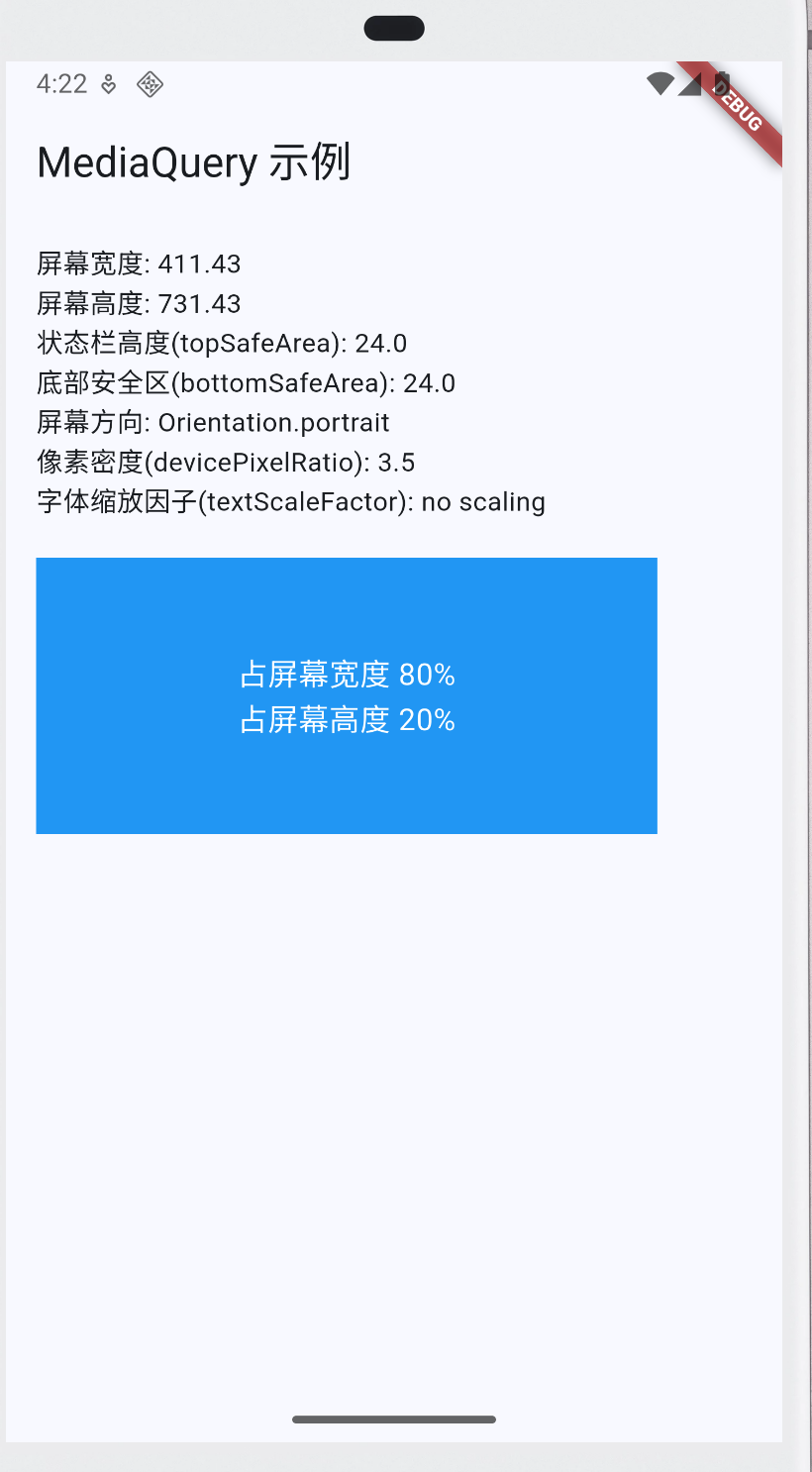
Text("屏幕宽度: ${size.width.toStringAsFixed(2)}"),
Text("屏幕高度: ${size.height.toStringAsFixed(2)}"),
Text("状态栏高度(topSafeArea): $topSafeArea"),
Text("底部安全区(bottomSafeArea): $bottomSafeArea"),
Text("屏幕方向: $orientation"),
Text("像素密度(devicePixelRatio): $devicePixelRatio"),
Text("字体缩放因子(textScaleFactor): $textScale"),
const SizedBox(height: 20),
// 演示容器按屏幕宽高比例适配
Container(
width: size.width * 0.8,
height: size.height * 0.2,
color: Colors.blue,
child: const Center(
child: Text(
"占屏幕宽度 80%\n占屏幕高度 20%",
style: TextStyle(color: Colors.white, fontSize: 16),
textAlign: TextAlign.center,
),
),
),
],
),
),
);
}
}
屏幕适配
理解适配的核心问题
设计稿通常是以某个固定分辨率(比如 375×812 的 iPhone X)来设计的。但 Flutter App 需要跑在各种屏幕上:
- 不同 分辨率(720p, 1080p, 2K…)
- 不同 屏幕大小(4.7寸,6.5寸,平板…)
- 不同 像素密度(ppi/dpi)。
所以核心目标是:按比例缩放布局、字体和间距,让不同设备上看起来接近一致。
使用MediaQuery实现屏幕适配
核心思想
不要写死
width: 300, height: 500这种值。而是按 屏幕宽度 / 高度的百分比 去计算。
比如:设计稿中按钮宽度 = 375(设计稿宽度)的一半。在 Flutter 中就写成:
width: MediaQuery.of(context).size.width * 0.5这样无论手机是 360 宽(小屏)还是 1080 宽(大屏),按钮都会占屏幕的一半,看起来就一致。
代码
import 'package:flutter/material.dart';

void main() {
  runApp(const MyApp());
}

class MyApp extends StatelessWidget {
  const MyApp({super.key});

  @override
  Widget build(BuildContext context) {
    return MaterialApp(
      theme: ThemeData(
        colorScheme: ColorScheme.fromSeed(seedColor: Colors.blue), // 只传蓝色
        useMaterial3: true,
      ),
      home: const ResponsiveCard(),
    );
  }
}

class ResponsiveCard extends StatelessWidget {
  const ResponsiveCard({super.key});

  @override
  Widget build(BuildContext context) {
    final size = MediaQuery.of(context).size; // 屏幕宽高
    final width = size.width;
    final height = size.height;

    return Scaffold(
      appBar: AppBar(title: const Text("MediaQuery 自适应示例")),
      body: Center(
        child: Container(
          width: width * 0.9,
          height: height * 0.25,
          decoration: BoxDecoration(
            color: Colors.blue,
            borderRadius: BorderRadius.circular(16),
          ),
          child: Center(
            child: Text(
              "自适应卡片",
              style: TextStyle(
                fontSize: width * 0.06, // 字体随宽度缩放
                color: Colors.white,
              ),
            ),
          ),
        ),
      ),
    );
  }
}

